드래그 앤 드롭 대시보드와 40개 이상의 차트 유형을 갖춘 강력하고 직관적인 비즈니스 인텔리전스 플랫폼
Mapsly Analytics는 현대적이고 기업용으로 준비된 셀프 서비스 비즈니스 인텔리전스 플랫폼입니다. 빠르고 직관적이며 모든 숙련도 사용자가 간단한 인터페이스를 사용하여 Mapsly 데이터를 쉽게 탐색할 수 있는 다양한 옵션을 제공합니다. 코딩 없는 비주얼 빌더 또는 최신식의 SQL IDE, 그리고 사용하여 시각화하세요 40가지 차트 유형, 단순 원형 차트부터 매우 정교한 지리 공간 차트까지.
경로 활동, 체크인 데이터를 포함한 모든 Mapsly 데이터, 귀하의 CRM 데이터(포함 사용자 정의 객체 및 사용자 정의 필드), Google Sheets 및 Mapsly API 또는 Zapier를 통해 Mapsly로 전송된 데이터는 추가 통합이나 데이터 매핑 없이 즉시 Mapsly Analytics에서 사용할 수 있습니다.
주요 특징
Mapsly Analytics에는 고급 기능이 탑재되어 있어 모든 수준의 사용자가 자신의 데이터를 탐색하고 시각화할 수 있습니다.
대시보드 끌어서 놓기
드래그 앤 드롭 시각적 빌더를 사용하여 몇 분 만에 복잡하고 아름다운 차트와 대시보드를 만드세요
40개 이상의 차트 유형
간단한 원형 및 선형 차트부터 복잡한 지리 공간 및 퍼널 차트에 이르기까지 40개 이상의 차트 모음을 탐색하세요
고급 필터링
차트별 교차 필터와 대시보드 수준의 필터 및 변수를 결합하여 연결된 차트를 만드세요
드릴다운 및 드릴업
다양한 데이터 집계 수준 간을 쉽게 전환하고 기본 데이터 레코드에 빠르게 액세스하세요
사용자 지정 열 및 데이터 세트
SQL 표현식을 기반으로 사용자 지정 열을 데이터 세트에 추가하세요. 하나 이상의 데이터 소스에서 데이터를 가상 데이터 세트로 사전 집계하세요.
직접 SQL 액세스
SQL 쿼리를 사용하여 모든 데이터 소스의 데이터 테이블에 직접 액세스하세요
현장 영업 및 서비스 팀을 위한 분석
Mapsly Analytics에는 두 가지 사전 구성된 설정이 포함되어 있습니다 현장 영업 및 서비스 팀에 대한 360º 뷰를 제공하는 대시보드 활동 및 성과. 기존 차트를 편집하고 새 차트를 이러한 대시보드에 추가하여 맞춤형 분석 요구 사항을 충족할 수 있습니다. 그리고 CRM 데이터가 Mapsly Analytics에 미리 로드되어 있으므로 Mapsly의 라우팅 데이터와 쉽게 결합하여 더 깊은 인사이트를 얻을 수 있습니다. Mapsly 도움말 센터에서 자세히 알아보기.
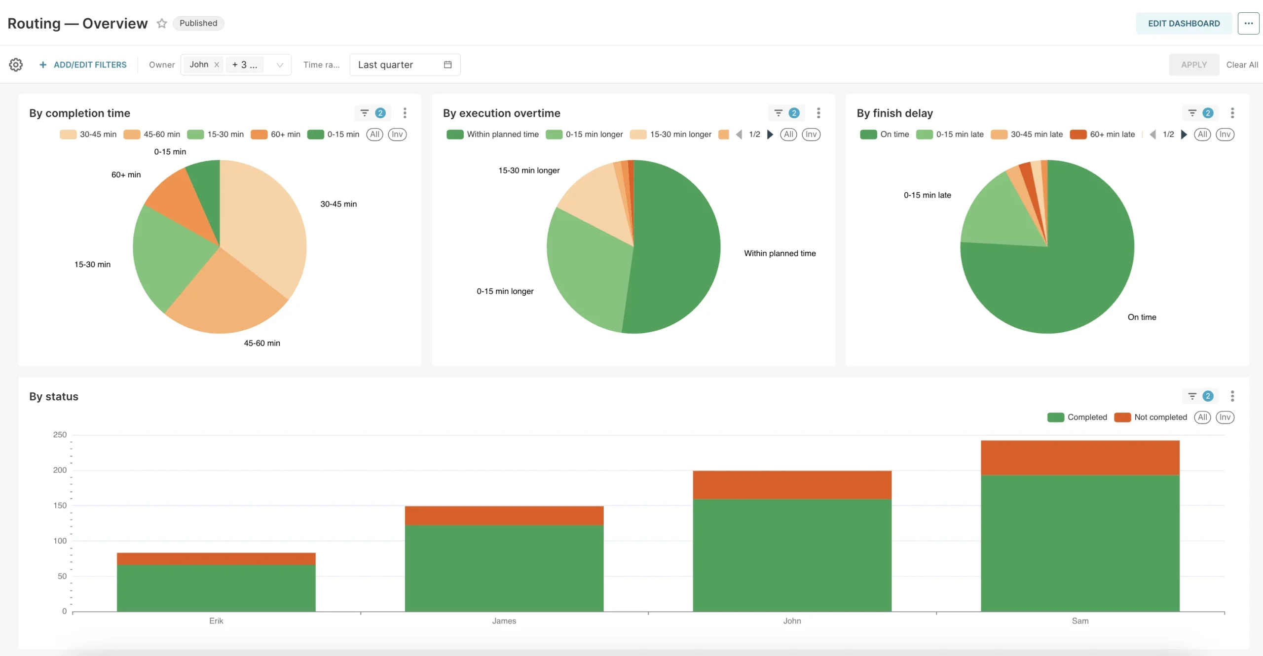
라우팅 — 개요
그 안에 방문 섹션:
총 계획된 방문 수, 다음으로 세분화됨 총 완료방문 그리고 총 실패한 방문 수;
오늘 방문 기간 동안 하루당 방문 수를 보여주는 추세선과 함께;
상태별 총 방문 횟수 (완료, 실패 및 사용자 지정 경로 활동 상태 등);
시작 지연별 완료된 방문 총합: 제시간에 시작됨, 최대 15분 지연 시작, 15-30분 지연 시작, …, 1시간 이상 지연 시작;
사용자의 위치로부터의 거리별 완료 합계: 사용자가 위치에 있음(거리 500m 이내), 사용자가 위치에서 500-1000미터 떨어져 있음, …, 사용자가 위치에서 5km 이상 떨어져 있음.
그것의 경로 섹션 비교 계획됨 사용자의 일일 경로를 기준으로 한 거리 및 시간, 대비하여 여행한 Mapsly’s를 사용하여 기록된 거리 및 시간 위치 추적 그리고 이동 시간, 대기 시간, 방문 시간을 구성 요소로 분류하여 총 계획된 거리와 시간을 표시합니다.
같은 정보가 각 사용자별로도 표시되며, 지정된 기간 동안 각 사용자가 이동한 일수도 함께 보여줍니다.
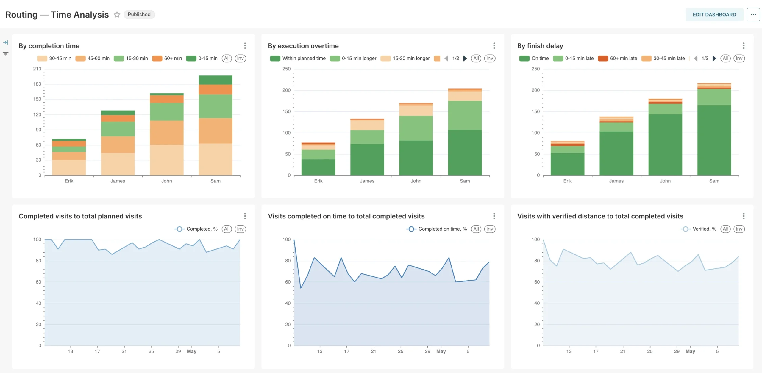
경로 지정 — 시간 분석
이 대시보드는 지정된 기간(예: 6개월)과 지정된 시간 단위(예: 1주)에 대해 선택한 사용자별로, 그리고 모두 합산된 상태로 위에서 언급한 지표가 어떻게 변하는지 보여줍니다.
팀의 생산성을 3배 향상하세요:
완벽한 현장 팀 매뉴얼 받기
고성과 현장 팀의 전략으로 시간을 절약하고 완벽한 데이터를 캡처하며 매일 더 많은 방문을 제공합니다.
Mapsly Analytics 가격
Mapsly Analytics는 모든 Mapsly 요금제에서 애드온으로 제공되며 사용자당 가격이 책정됩니다: 신규 대시보드 생성 및 기존 대시보드 수정 가능 사용자는 사용자당 €38, 보기 전용 사용자는 사용자당 €13.